We, humans, are highly visual creatures. We rely heavily on the visual signals around us to make important decisions in life whether it’s choosing your next meal or finding yourself the right partner.
Fun Fact: Half of the brain is directly or indirectly involved in processing visual information. [source]
Being a blogger, if you don’t take this fact into account, you are at a loss. Your graphics, especially the ones that are intended to make the user click, play a significant role in attracting your audience.
So, let’s talk about featured images for blog posts today.
What is a featured image?
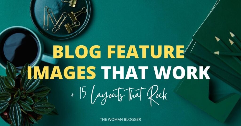
Simply put, the image that can make the user want to read your article or just pass by. A featured image is the primary image of your blog post that shows up in your blog archive and most of your social media accounts.
Why do you need one?
Images create an impact on your readers, especially if they are done right. The right design with the right words can make your game and an otherwise design can break it too.
Readers love visual content, it catches the eye better. Here are some stats to support this stance:
Visuals increase the desire to read the content by 80%. (source)
Our brain processes visuals 60,000 times faster than text. (source)
Posts that include images produce 650% higher engagement than text-only posts. (source)
Visuals alter decisions. Your readers are more likely to click and read a blog post if they find your featured image appealing.
Best featured image Sizes
There are various different sizes of featured images on different websites and platforms. Generally speaking, the size that performs well on websites, as well as many major social media platforms, is 1200 x 628 pixels.
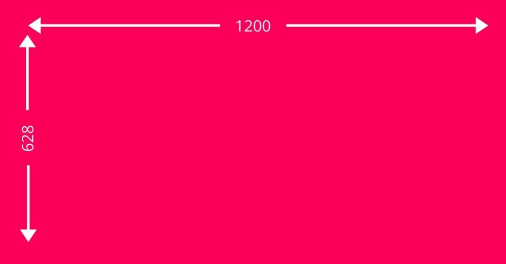
Do keep in mind, your feature image size can vary depending on the theme or template that you are using on your website or blog. That is completely fine. Just do a quick search on the feature size that works for you and start seeing the magic.
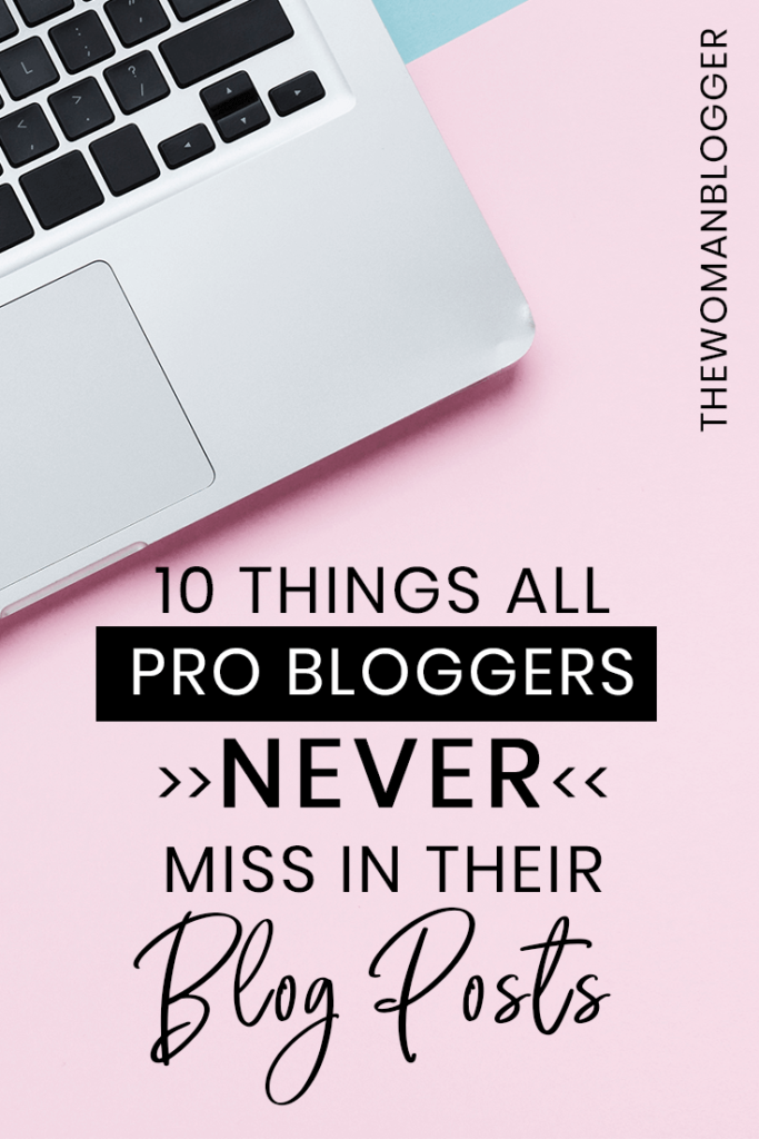
Pinterest Pin as Featured Image
If you’ve been following me, you must have noticed I use my Pinterest Pin as my blog’s featured image. There are a couple of reasons why you would want to do that:
a. Your major source of traffic is coming from Pinterest. You want your content to feel easily pinnable.
b. When your user clicks to pin your post, the first image that appears is your Pin image. This, when pinned on Pinterest, is visually more appealing and, of course, readable.
Pinterest pin size graphics are usually around 1000 x 1500 pixels.
Free Tools to Create Featured Images for your Blog
You need a place to design amazing looking Featured Images for your blog. So, here are some free options for you:
All these tools are online and free to use but you can go for an upgrade to improve your designs.
Premium Tools to make Featured Images for your Blog
If you want all the features you can have for creating Blog graphics and the flexibility to create anything your business requires in graphics, you can check out some of these premium tools for making blog featured images too:
Free & Premium Stock Image Resources
There are a ton of places to get quality free and premium (affordable) stock photos for your blog featured images. Here are a few worth mentioning:
- Pexels (free)
- Unsplash (free)
- Freepik (free/paid)
- DepositPhotos (paid)
Need to see more options? Check out these blog posts for more stock photo websites.
Find Beautiful Free Stock Photos For Your Brand New Blog!
7 Perfect Places To Get Affordable Royalty-Free Stock Photos
15 Layouts that Rock
Now for the best part. What are some designs that work great when it comes to blog featured images?
1. Half and Half

A very minimal and clean look can simply be achieved by using your brand colors and perfectly matching images. This design is not only simple but very easy to the eyes as well.
2. Geometrical Shapes and Text

Using images in your featured images is a great idea but writing visible text on those images is always a challenge. Make use of geometric shapes to emphasize on your text.
3. Typography
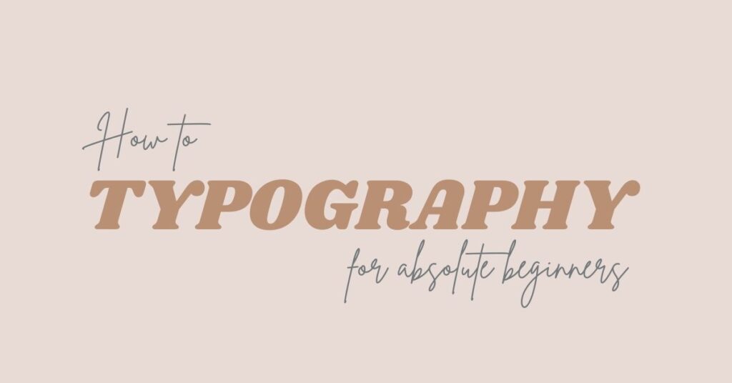
If you are a bit into designing I’m sure you must have heard about typography. Simply consider is playing with different types of fonts to get a nice, clean, readable and catchy design.
4. Overlays
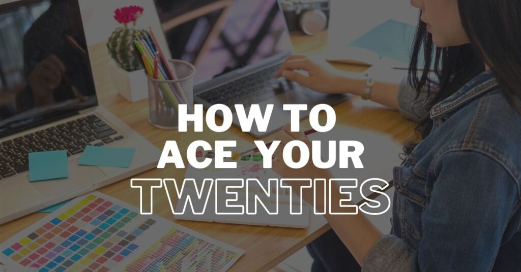
Remember we talked about how it’s difficult to read text written on images. A good way out is by using an overlay on your image. You can simply use black, white or any of your brand colors as an overlay. Think of an overlay as a layer on top of your image that is reduced in opacity. You can see the image underneath and read the text clearly as well.
5. Flatlay Images and Text

Whoever came up with the idea of flatlay images was a pure genius. Flatlay images are not just great to look at but they can carry a lot of meaning in them as well. A major plus is that you get a lot of real estate to write your headline on the image.
6. Vector Graphics
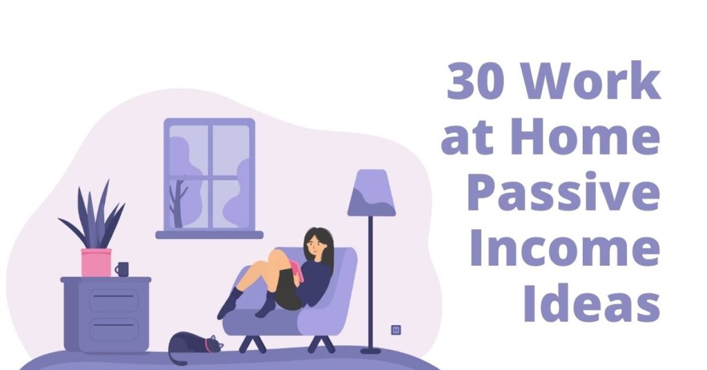
Relevant vector images can be a total game-changer. They can give your graphics and website a personality of their own. Bear in mind you can’t just pick anything from the web and make it your own. Watch out for usage rights.
7. Abstract Backgrounds
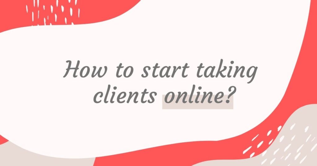
Abstract backgrounds can give your image a bit of design without overdoing it. Make use of the real estate to amplify your text.
8. Your Image and Text

If you can find an image where your text sits perfectly on top of it, you are a winner. Look for images that can contrast with your font colors to make them visible to the reader. Images of landscape, flatlay images, images with solid colors and images with a log of white space can work for you.
9. Minimal Photos and Text
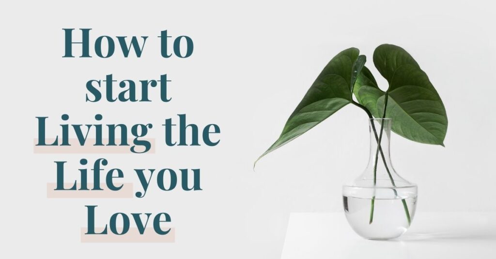
The best thing about the modern era is minimalism. While intricate designs have a feel of their own, there is nothing more soothing than a clean, minimal design.
10. Shapes with Opacity and Text
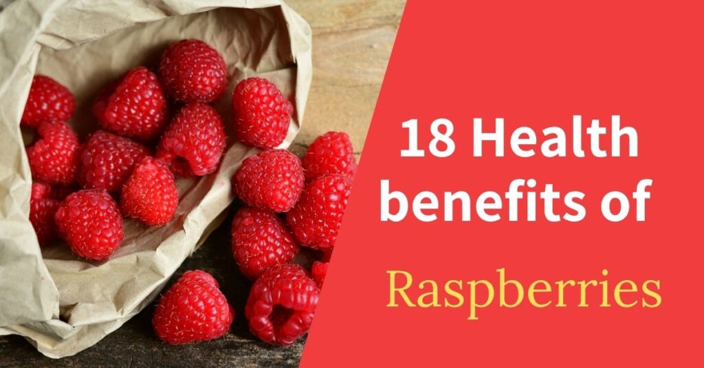
Make use of solid colors contrasting with your images and make use of shapes. You can even tweak the opacity of the shape on the right to give your graphic an expression.
11. Solid Brand Colors
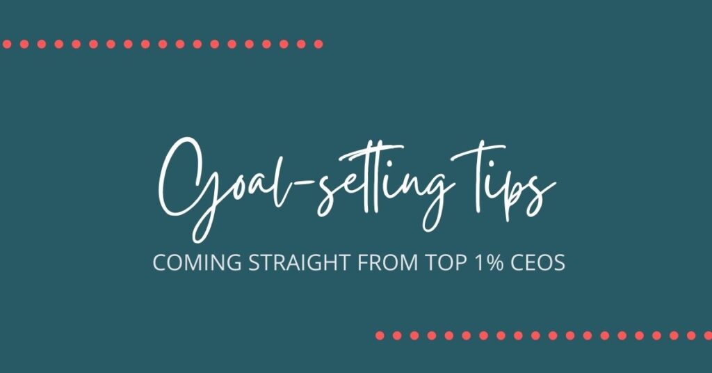
Brand colors always work. Simply put your brand fonts on top of your brand colors and you are good to go. Simple, yet efficient.
12. Hand-drawn Elements

You can make use of hand-drawn elements in your featured image designs. Not only do they add personality to your graphics but also give them a very raw and rustic feeling. Your brand might or might not support hand-drawn elements. But if done right they can look beautiful in your graphics.
13. Watercolor Elements
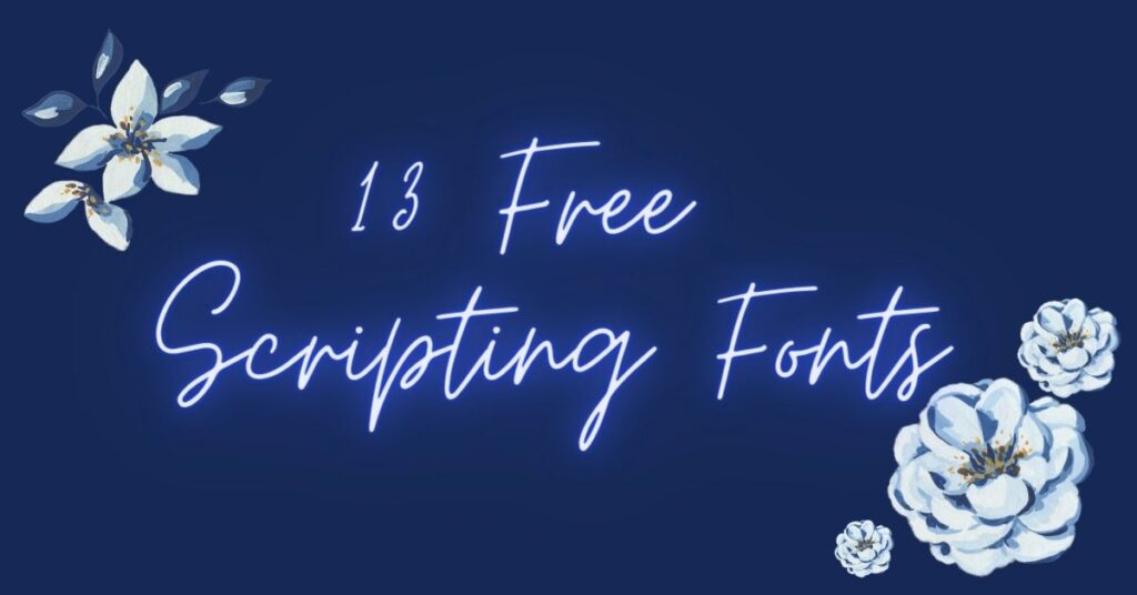
Another way to make your graphics look unique is by using watercolor elements in your designs. Go to places like Freepik and Creativemakret or Etsy to find tons and tons of watercolor resources. There is something for everyone.
14. Images with Abstract Designs

Abstract designs/shapes can work for your brand if you pair them right. Make use of the right images like the one in the graphic above. Even if your eye catches the lady first, her finger will guide your eyes to the heading in a matter of milliseconds.
15. Comic Style
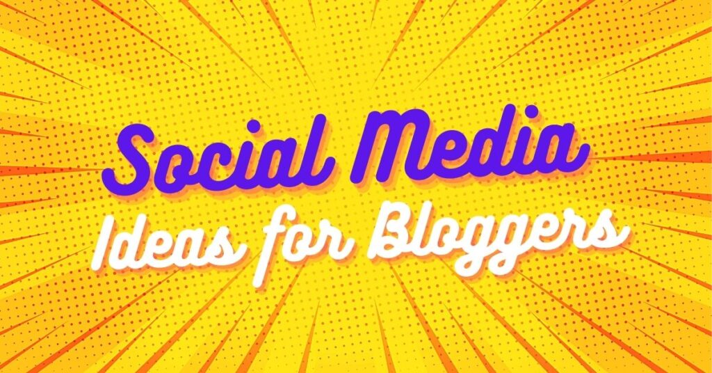
There can be a lot of fun ways of expressing your message via your visual designs on your blog. One of them is using the good old comic style graphics.
Again keep your branding in mind. There are a lot of ideas in this post that can work for your brand. Just make sure it feels and looks great. What type of designs do you prefer when it comes to your blog feature images? Let me know in the comments section.
Are you a blogger looking for blog feature images for your website or blog? Contact me for a bulk discount on blog feature image designs. Let me create the designs that work for your audience.
Pin it for later!
