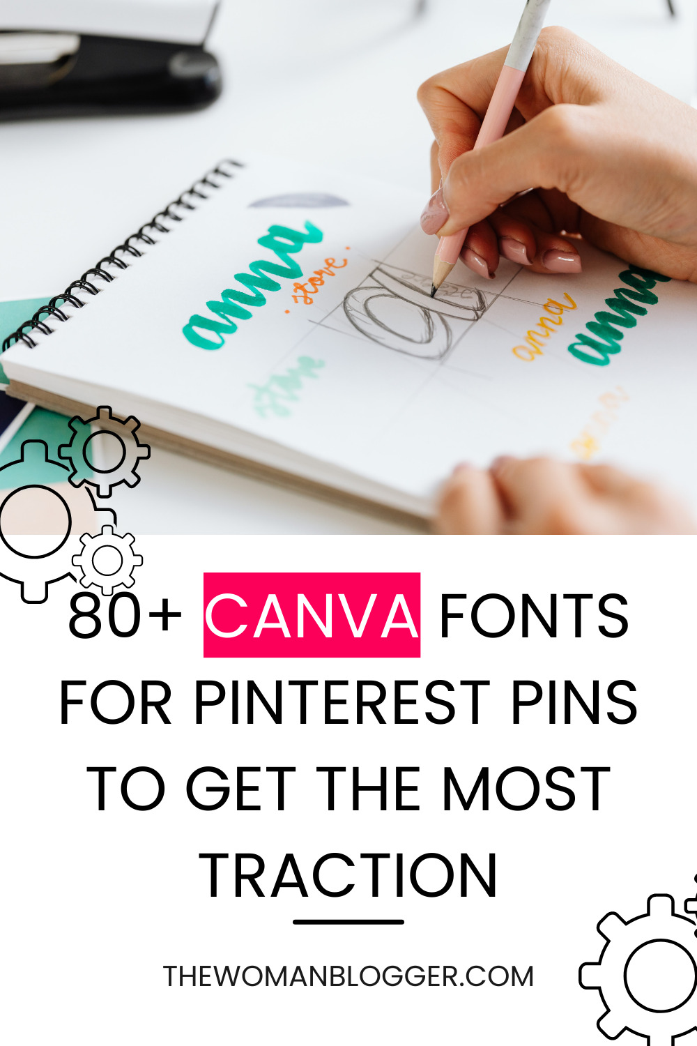
Why fonts are important?
Fonts can make or break the game for any design but they are also pretty important in other places like your website, emails, and other content you use to convey your messages to your ideal audience.
They deliver the message and feeling of your brand in an instant and subconsciously. Typography and those studying design psychology go into great depth when it comes to the typeface (font for simplicity) you are using. The type of font you use can be a game-changer for your Pinterest Pins.
But in a sea of thousands of fonts, how do you select the best ones for your business? Here’s everything you need to know for starters. We won’t go into the nitty-gritty of Typography, as that is something for the designers. As a business owner trying to DIY your Pinterest designs, this will be a great start.
Difference between typeface and fonts
Typefaces and Fonts are usually considered to be the same things but they are actually not. A typeface, you can say, is a particular style of lettering. While fonts are different variations of a typeface. These variations are usually a different weight and size. A typeface is a group of fonts that share an aesthetic.
Type anatomy
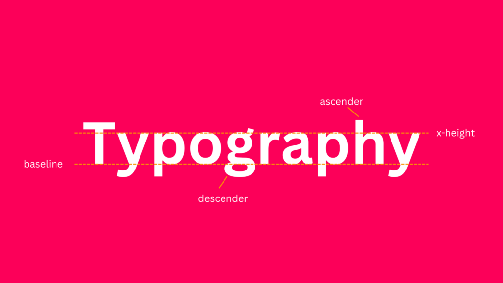
All types are constructed using some kind of proportions or metrics. They sit on an invisible line called the baseline. The x-height is the height of the main body of lowercase letters. Any part above the x-height is an ascender. Any part below the baseline is a descender. In uppercase letters, the height of a letter is slightly shorter than the height of the ascenders These proportions and guidelines are used to make any typeface more readable and easy for the eye to comprehend.
The four main typefaces and their uses
1. Serif Type
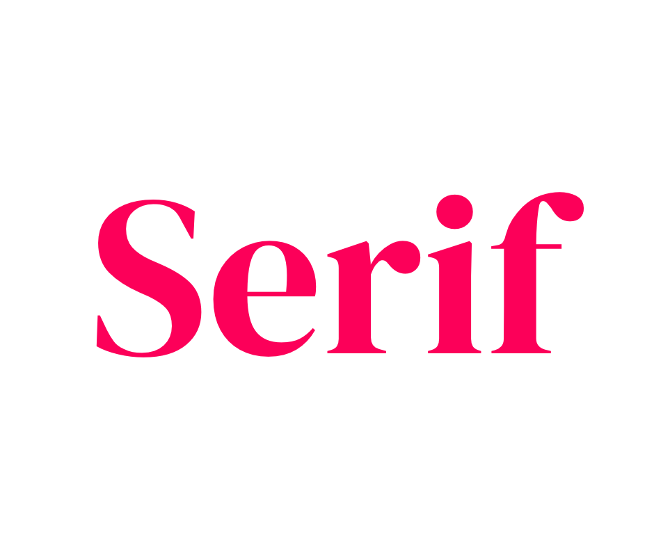
Serif types are fonts that have a little feet-like projection at the end of the letter strokes. These are one of the oldest and original fonts. Over time we’ve seen many variations in the serif type like transitional, old-style, classical, and neo-classical. Each gives away information about the era in which they were developed.
Main usage:
Mainly used for body text as it makes dense information easy to read. These are found everywhere around us in books, documents, logos, print-copy and magazine covers. You will see them in titles and long forms of texts too.
Meaning conveyed:
These give away the meaning of sophistication, classiness, and timelessness. They are also used in brands that want to convey a feeling of being modern but elegant or luxurious. If you want your brand to look traditional, established, trustworthy or reliable, serif types are a great way to go.
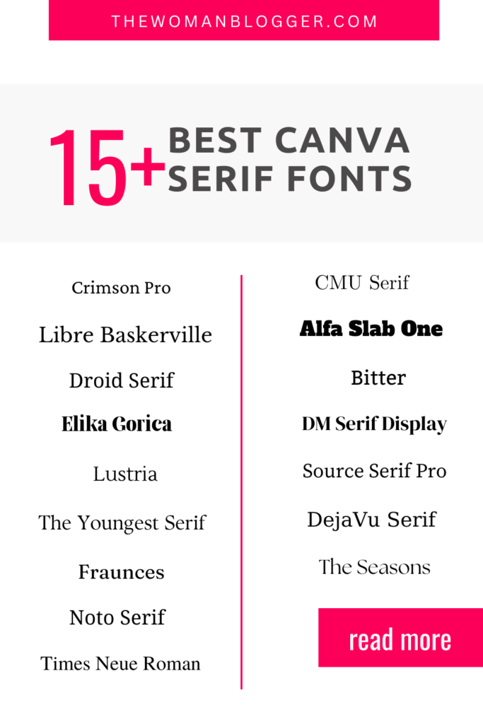
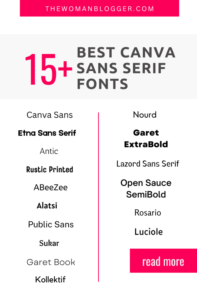
Canva Fonts in the category:
2. Sans Serif Type
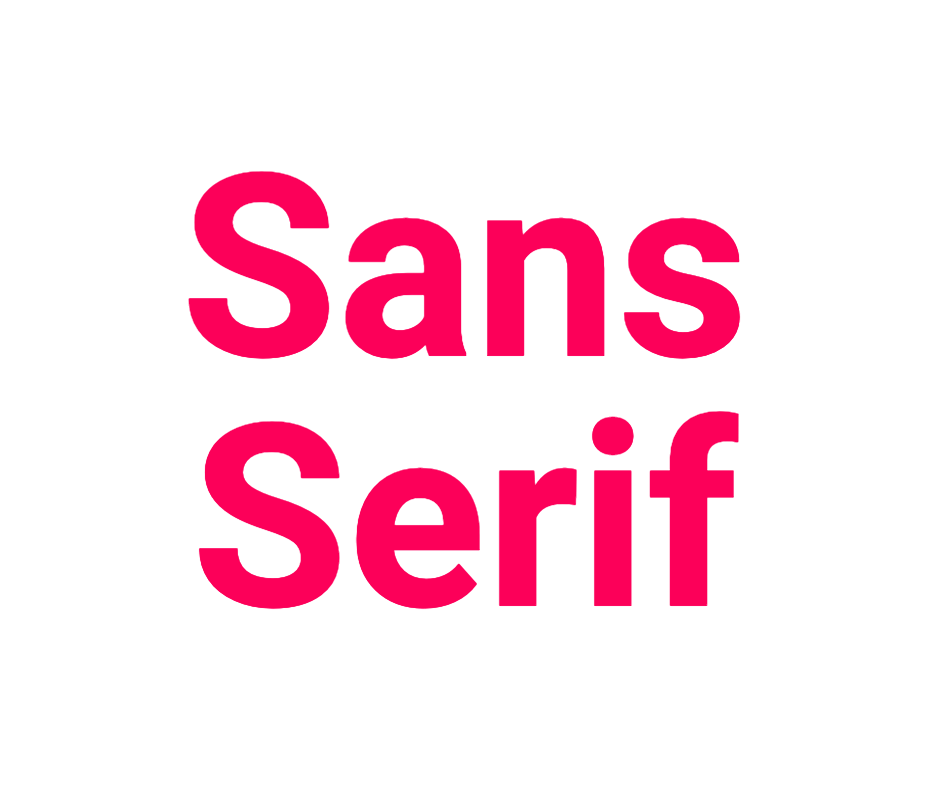
Sans comes from a French word meaning ‘without’. Sans serif literally means without serif. This means typefaces in this category don’t have those feet-like projections at the end of letter strokes.
Main usage:
You may have seen a lot of sans serif type being used on the web and especially small screens like tablets and mobile phones. A lot of corporate branding uses fonts of this type. They are hot favourites when it comes to logos and headlines. The most popular industry using sans serifs is the start-up and the tech industry as the type gives away a feeling of being cutting-edge too.
Meaning conveyed:
These types are great at conveying a meaning of clean, sophisticated, modern, and minimalist feelings. They are more relaxed and somewhat casual when compared to the serif family. Unlike serifs, sans serifs throw the element of tradition pretty much out of the window. Brands that want to target youth and give a feeling of being accessible use sans serif types.
Canva Fonts in the category:
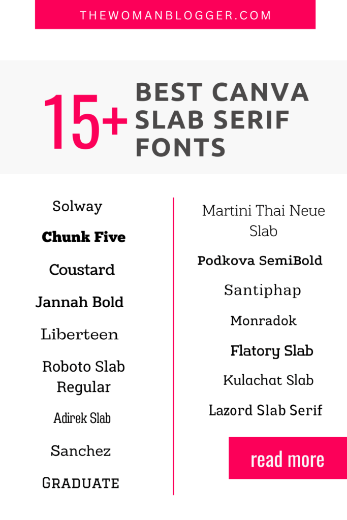
3. Slab Serif Type

Slab serifs are loud bold cousins of serifs. They came into existence in the 19th century mainly on billboards and posters. They have large and impressive serifs (feet-like projections at the end of letter strokes).
Main usage:
They are great at throwing and highlighting any message to you even at a distance. Using slab serif fonts for body text and long-form content is not a great idea. They are usually used in headlines, book covers, logos, posters, advertisements, to make announcements or as complementary type.
Meaning conveyed:
Slab serif, as the name says, is a bold and heavy type. They appear very dramatic and can easily catch attention. For a non-designer, using these typefaces can be a tricky task. They are often not easy to adhere to the rest of the design unless you know what you are doing and why.
Canva Fonts in the category:
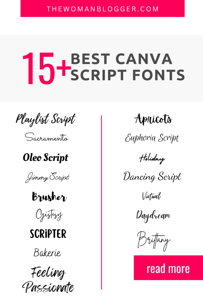
4. Script Type
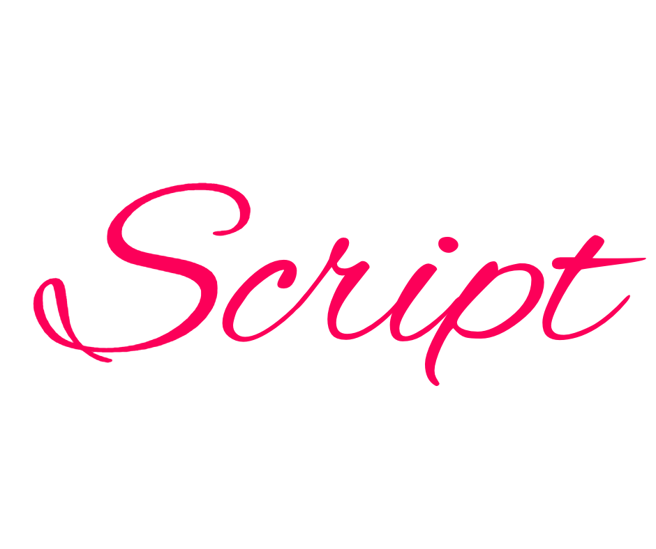
These typefaces closely resemble handwritings. In fact, a category in script typefaces come from the handwriting of historically famous calligraphers. These typefaces are casual and give a homely feeling.
Main usage:
Logos, wedding or party invitations, and typographic posters use scripting fonts. You will find a great number of businesses use these fonts in combination with other types on social media and Pinterest especially. You will see a lot of these fonts in brand names, product names, and little notes on cards, and posters.
Meaning conveyed:
These fonts are casual, inviting, feminine and give a feeling of homeliness. Home-based businesses especially in the arts and crafts sector use this font in many creative ways. Female-lead businesses are another type of business that use these types in their branding.
Canva Fonts in the category:
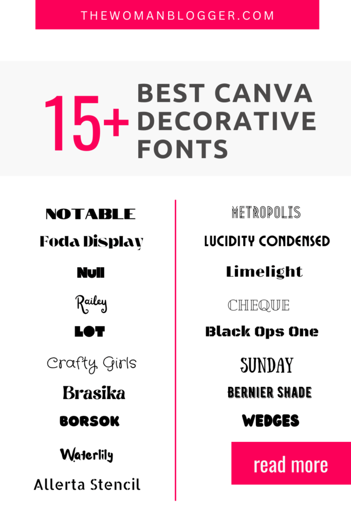
5. Decorative Fonts

Also known as display fonts, these are used in very limited amounts of texts usually in headlines and titles. These are experimental fonts and are used for exactly what the name says: decoration.
Main usage:
Never use these fonts for text blocks or long headlines. They should be used sparingly and only where they make sense.
Meaning conveyed:
Fun, creative, decorative and out of the box branding can make great use of these fonts.
Canva Fonts in the category:
Important things to consider while using Canva fonts for Pinterest
So, these were the 5 types you needed to know about before using them for any purpose on your designs. Now that you have an understanding of what font to use and when, here are a couple of things to be careful of:
1. It’s important to consider the image ratios that work on Pinterest. For instance, a blog post pin image will usually be 1000px by 1500px.
2. Your fonts should be readable, consistent, and speak for your brand. Excessive use of cursive/script/decorative/display fonts may make your graphics less readable and gain no traction.
3. Try and go for fonts that are unique and not all over Pinterest. Try to stand out from the crowd but stay consistent so it’s easy for your ideal audience to recognize you.
4. Make use of font weight and font sizes to make sure the most important bit of information stands out to the viewer.
5. Keep in mind, many Pinterest users are on mobile and so the text you are using should be readable on small screens.
6. Make use of your brand-specific color palette so that your designs leave an imprint on your readers’ minds. They will soon start recognizing you and your business because of the colors, fonts, and consistency in your designs.
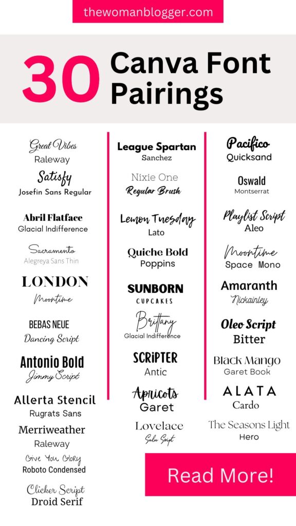
Canva Font Pairs for Beautiful Pin Designs
Here are 30 examples of beautiful and consistent font pairs you can use on your designs on your Pinterest Pins to stand out and get traction. Don’t forget to save or pin it for later use as well.

Pretty! This has been a really wonderful post. Many thanks for providing these details.